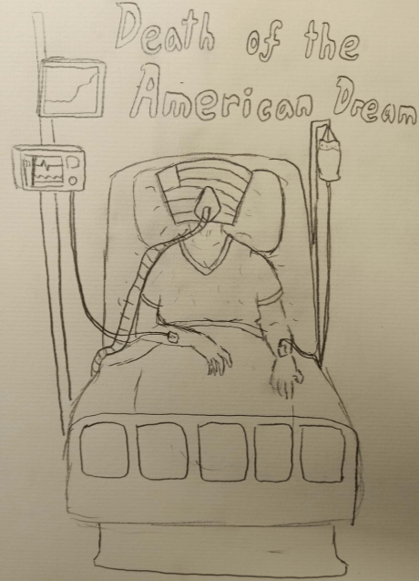
I definitely wanted to comment on an idea that would be present to my entire generation, so ideas such as the crippling student debt that many college attendants face, to the “embarrassed millionaire” complex, to even the division within the United States down party lines came up. However, I settled on the American Dream and it’s state in contemporary culture to show how America has really evolved. Coming from a relatively privileged area of the world, and even of the United States, I think that its important to be aware of things outside the sphere in which I grew up. Throughout middle and high school, one of the biggest ideas taught to me in terms of the culture of the United States was the idea of the “American Dream”, and how America was and is a land where anyone can achieve anything. However, given the contemporary culture of “everyone for themselves” and the presence of late stage capitalism that seems to strangle and poison the United States, I thought it fitting to show the true state of the American Dream in my eyes; on its last legs, dying alone and un-cared for. I think I was able to make the American Dream seem in a decrepit stage, slowly fading from existence. However, if I were to do it again, I would try to digitize it first, as to add color and add even more context of the Dream’s isolated death.
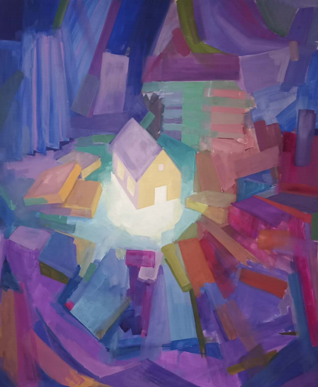
Exhibition Information: Artist: Melissa Flores Media: Painting Gallery: Dennis W. Dutzi Gallery Social Media: @melissaflores.art
About the Artist: LBSU undergraduate Melissa Flores is working toward her BFA degree in the School of Art’s Drawing and Painting Program.
Formal Analysis: The art piece is of a house centered in the middle of a gathering of unspecified objects. The piece is paint on a paper background. All of the colors used to colored the unspecified objects are relatively cold, and are muted in intensity, featuring oranges, blues, blue-greens, and maroon reds. These colors are meant to make those surrounding areas unfriendly and foreign, seen as cold and uncomfortable, while the center of the page is colored with a warm glow of yellow and white-green, which creates an inviting and calming feeling. The use of shapes as the surrounding objects; unidentified and indistinct gives an unsettling tone, while the obvious silhouette of the house (which is a common object) is much more recognizable and comforting.
Content Analysis: This piece was meant to focus on the illusion of boundaries, and how those affect our perceptions of everyday life. In that, there is a very clear boundary around the house that can be deemed as “safe” while the other areas are rough and “unsafe”, creating the illusion of a boundary within the picture itself. However, these borders are not hard borders, as Flores also wanted to detail the permeability of these perceived boundaries. The gentle fade out of the warming lights recede into the outer boundaries, which in the fact that it doesn’t suddenly transition to a different color type, gives this sense of permeability. And it was on this permeability that Flores really wanted to commentate, especially it’s effect on a boundary’s ability to either contain or dis-silence those interacting by it.
Synthesis: The first thing that drew me to this piece was how peaceful it seemed, with vivid colors and an abstract concepts. The melding of the boundary between the clearing and what lies beyond, in my mind, echoes what human morality can be like. When one thinks of the word boundary, many people would think about a well defined object, that is black and white, much like I saw morality when I was younger. However, by displaying not only the colors of the two areas, but by displaying them in similar colors, I think Flores shows the evolution of the idea of morality as one ages, as those lines become unclear, and we can see that rather than black and white, morality is truly different shades of gray, unique for each person.
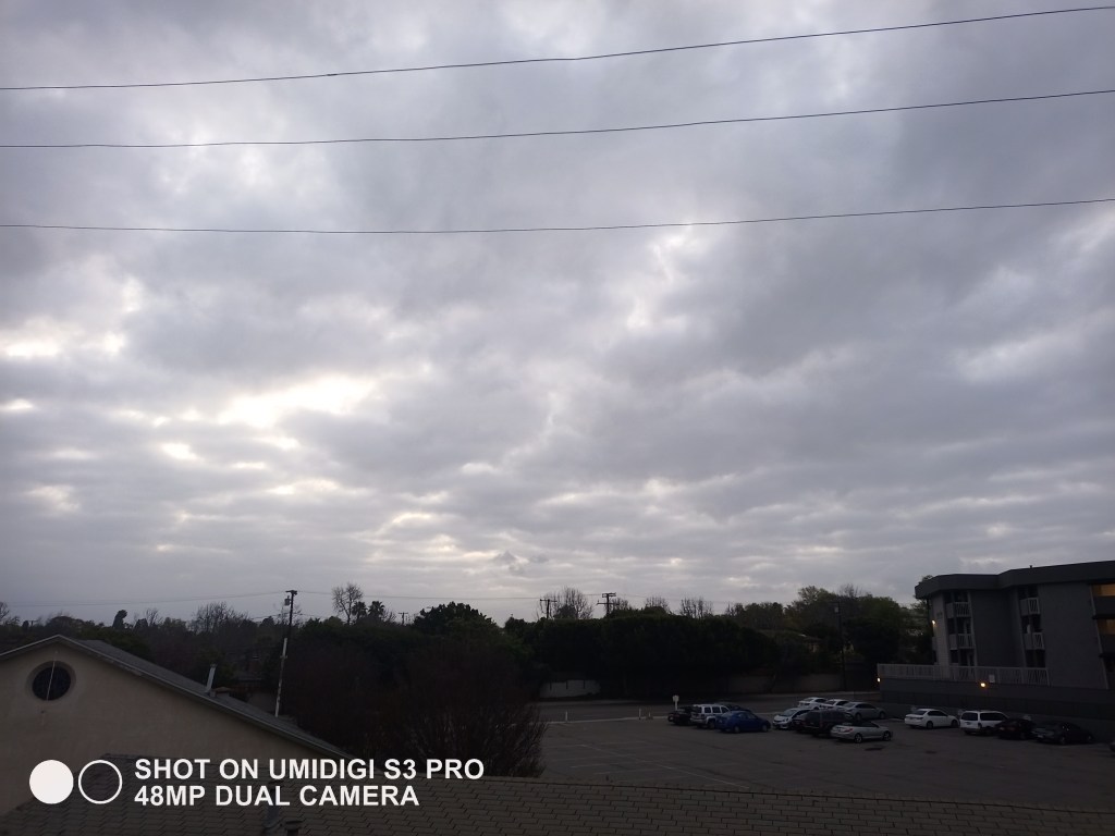
Sunrise in Long Beach, 6:29 AMSunset in Long Beach, September 15th 2019Sunset at Long Beach, 5:44 PM Sunset in Long Beach, 6:09PM on SaturdayPost-Sunset Long Beach, 6:17PM The Bright Sky at Long Beach, 3:04 AM
As I often spend most of my time indoors, one of the changes I’ve made since coming to Long Beach has been to try and take pictures of the sunset everyday from my dorm. I wanted to compile these pictures to show the story of the sky in Long Beach on a day to day, with the most interesting phenomena being that the sky will light up bright gray when its early in the morning.
I think my pictures adequately capture the vivid colors and contrasts that the sky emits. It also gives a linear progression throughout the different seasons that reflects the story accurately.
Individually, I think the 4th picture in the collage is the best, as it has the most colors present. A close runner up would be the last picture, as it shows a sort of vibrant energy even in the dead of night.
I think the first picture, though the sky is mostly covered by clouds, is very important to the collage while also not being very striking in itself. Not only does the picture set up a baseline on which the rest of the pictures can carry, but also gives a frame to reference the last image to: they are close in brightness yet distant in expectation.
I think next time, I would want to get a new sunrise picture with a clear sky, to better contrast the clear skies of sunset that are commonly present in the pictures.
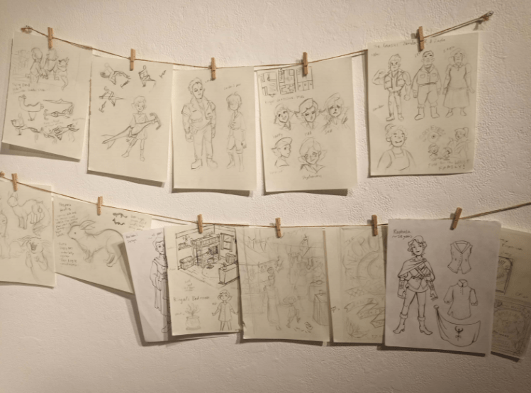
Character Models and Concepts, Animation and Storyboards.
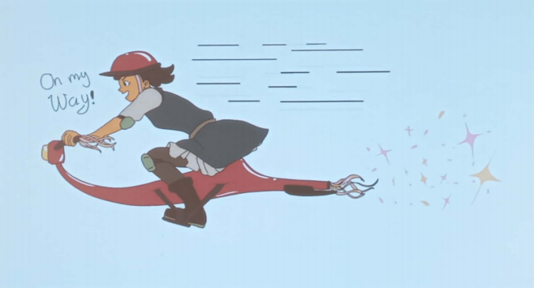
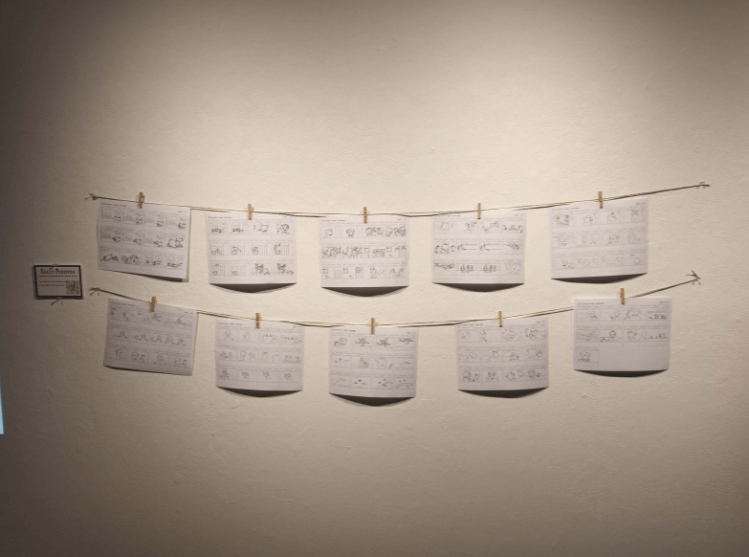
Exhibition Information: Artists: Janet Doan, Collin Wilhelm, Diana Nguyen, Amber Arzaga, Georgina Fang, Lilly Ngov, Rose Cuenca, Sol Barrios, Kelly Pfeiffer, Alexa Lui, and Ren Torres Media: Animation and Storyboard Gallery: Marilyn Werby Gallery, CSU Long Beach Social Media: Jananachips, Faikentt, Apricitydia.gram, Amberrycold, Georgyfang, Lillianuzi, Red8Rose8, Solscribble, Curiouslittlecritter, skellaradart, 4cetone
About the Artists: The artists are all students in Cal State Long Beach’s School of Art, with a majority of them pursuing BFAs in the Animation/Illustration or Pre-Production programs.
Formal Analysis: Both the storyboard and the animation uses black and white to carve out a rough sketch of the plot. The characters are composed of spherical shapes to draw out a cartoon-like feel. But while the storyboard and animation do not have color, the concept art that the work is based on are colored. The usage of soft primary colors are meant to elicit feelings of childhood, as the story depicts the last days of summer before school. The pace at which the animation flows is the same as 24 frame cartoons that run on TV, which helps with understandability, especially among children. As such, the rhythm of the work is ideal.
Content Analysis: The story follows the life of a bastard child conceived in during a resurrection ritual performed by her father, and as such, has a few compelling ideas prevalent. In the short storyboard that was included with the piece as a sample, themes of growth and comradery were foremost; the growth of character by learning from mistakes, and the comradery of youth that helped them find the lost pet. But most central to the storyboard was the idea of family, with not only the protagonists serving as a small family of their own, but also with the main motivation of the piece; the pet running away, being centered around him wanting to be with his budding family. The artists were inspired by the cartoons that they had all grown up around and wanted to make a piece like that which influenced their own childhood.
Synthesis: Though technically the work is not complete, the small glimpse that the artists show remind me of childhood innocence and the days lost to seemingly endless adventures. While it was the media in which they designed their piece (animation) that drew me in, it was their portrayal of that childhood ignorance which resonated with me. Children often are unaware of larger things at work, caught in their own little worlds that shape their everyday. The protagonist’s questionable birth set aside over trying to find their pet, and it is that difficult portrayal that the animators have managed to capture, and remind me of when I was young, and unaware of the world.
Drawing has been one of my hobbies for over a decade now, with most of my family being somewhat proficient in it. Drawing is my favorite type of expression, and one of my favorite activities to do when I have free time. This activity was definitely fun for me, although there was a minor time constraint with having to draw 6 sketches in about an hour and thirty minutes.
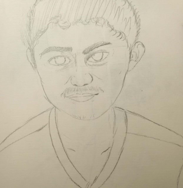
A portrait of Jorge
As such, I don’t think that I would specifically try this activity again, but sitting down and sketching some objects was very therapeutic for me, and I think I will definitely do it again, sometime in the near future.
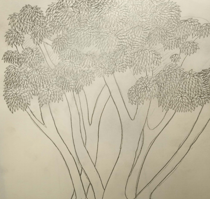
A tree near the USU, outside Robeks
For most of my life, I’ve tried to do some sort of drawing, sometimes practicing, sometimes just expressing, and I would like to think that my drawings are okay at least. I do think I can get a lot better with more practice, and just learning different techniques to make things more aesthetically pleasing.
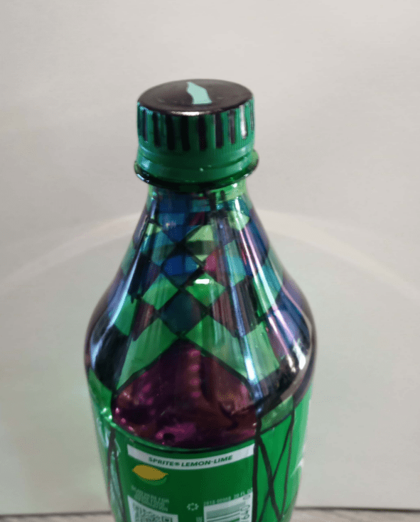
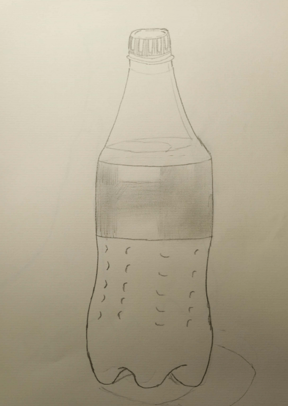
A Sprite Bottle
I am majoring in Computer Science, and I think that sketching can at the very least make a sort of plan when trying to develop a program. However, beyond that, nothing really comes to mind.
A different tree outside the USU
Drawing in my opinion is a language of its own, and I think the cliche saying of “a picture is worth a thousand words” hold true to drawings; its much easier to elicit emotions from an observer with drawing and images than is with words.
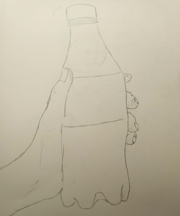
Contour Drawing of Myself, holding the Sprite Bottle
The art piece we chose was a window on the fifth floor of the University Library, where an observer could see the entirety of Northern Campus, and especially the Walter Pyramid, which is a landmark on our school campus. Our art piece was intended to depict not only how people can view the campus as art, but also talks about how people are projected to fit in to the school environment. We chose an octogonal shape as the frame, as those common to profile shots.
I think that the art was always there, but putting a frame around it lets it highlight itself to possible observers, and they can more easily recognize the value in it. As such, even after the frame is removed, the art still remains, just not as easily noticed to the passer-by.
My belief is that Art is in the intent of expression, so long as the creator meant for it to be art, it can be perceived as such. Following that idea, anything can be art, and anything can be NOT art.
Of course art isn’t limited to just objects, they can be ideas, people, anything that is intended. It can be a choice, such as taking the time to enjoy a view, or a way of enjoying something that hasn’t been done before. Art doesn’t have to be new, it doesn’t have to be old. Art resides in everything.
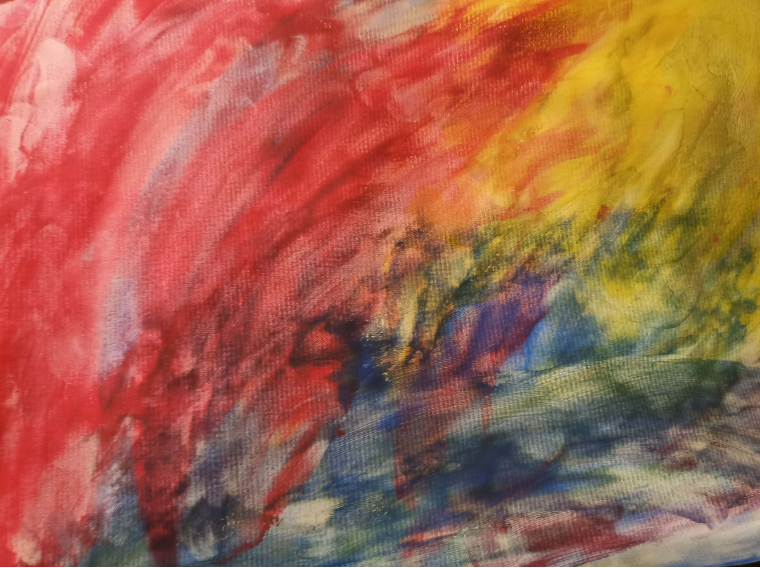
I think that this assignment was a lot harder than I charted it out to be. With the concept of trying to be abstract as the main goal, I tried to keep an empty mind and have no plan when beginning, but it seemed like every time that I thought about it, new ideas would form and I would try to categorize it into some sort of representational art. In the end, I had to turn some music on and just try and focus on that while painting. The result ended in a sort of segregated colors that sort of meld together on the edges.
The painting in question.
Trying to ensure that I had no pre-planned subject definitely proved to be the hardest part of the painting process, but once I began, I found it to be relaxing, I could just focus on making nice colors, without having to spend too much effort trying to fulfill any requirements.
This painting, and abstract painting in general I think are meant not to depict a specific thing to every viewer, like representational painting would, but rather it subconsciously forces the viewer to introspect, and instill meaning that is unique to each observer. In regard to other paintings that I’ve seen, I think it isn’t doing the art justice to compare and contrast one to another; each has their own purpose and tries to convince a viewer of something, whether it be unique or uniform.
Though I had mixed feelings about performing maintenance art at the beginning of the class session, going around campus and cleaning up trash left behind by Week of Welcome and other on campus activities had a sort of therapeutic effect, it worked well to make me feel relaxed. While cleaning the grass plaza of upper campus, I sort of had the realization that the paths and grass plots had their own sort of artistic grid, and helping to clean that up felt like I was adding a little bit of my own touch onto the expanse of art.
Picture after cleaning the Upper Campus of CSULB.
I believe that art can take on any sort of expression, whether it be constructive, destructive, or anything else. There is art in protest, there is art in maintenance, there is art in any sort of meaningful action, so long as it has purpose behind it.
I do believe that Mierle Laderman Ukeles’s Maintenance Art performance was indeed art. The performance taking place at an Art Museum didn’t make it any more “Art” than if she had performed it somewhere else.
As mentioned above, I believe it is the intent of the artist that defines the art, so even something such as getting a job as a janitor in a factory could have constituted art.
I don’t think that these topics (Women’s Work and the interpretations by Mierle Laderman Ukeles and Jennifer Lopez) are uniquely artistic, they have their own qualities, but they are definitely, in their own right, art.
In regards to maintenance art on the Walk of Fame, I can’t think of any Hollywood star (or any celebrity for that matter) that I would be willing to clean the star of.